One Room Challenge || The Reveal - Daughter's Study/ Play Room
Reveal Day is finally here!!! We are thrilled with this young, fresh and classic study/play room space. My daughter, Miss A, has never been more excited to do her homework and she has been reading non-stop since we finished it, which translates to success in my book. Miss A ADORES her redesigned room and feels like the luckiest girl in the world, which just makes my day. And it's a space the grown-ups love too. Win/Win. I just really hope she is further inspired to work and study hard during her new Middle School phase and beyond.
But before I give you the tour, I have to thank Linda and the One Room Challenge for creating the perfect platform to motivate us all to finish a room in just six weeks. It is so fun to be doing this alongside other creative and talented home interior enthusiasts. I have always enjoyed being a part of the One Room Challenge (you can see my past projects- my daughter's bedroom, my walk-in closet, our family room and our mudroom ). Basically, thanks to this challenge I have completed five spaces in my home already! I really enjoy the entire process but I think choosing the art is always my favorite part. If you are just tuning in for the first time you can see the first weeks here- week 1 (the detested before photos), week 2, week 3, week 4, week 5. And now for the tour- FINALLY!
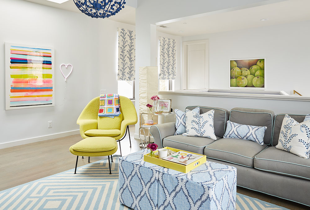
Oh My Goodness!! We are IN LOVE with this stunning GeeGee Collins piece titled Portofino Stripes (read more about GeeGee and the painting here). It is colorful and fun and just the perfect neighbor to our now beloved chartreuse womb chair. And of course we had to have some sort of neon light somewhere because there needs to be evidence of the tween hanging out here, enter the fun neon heart. The blanket was handmade by a friend of the family. It is totally retro-grannyish, but totally cozy and cool.
Below is the famous BRIGHT blue bookcase which we now can't live without. I know it's bold and was definitely a risk but the color is really comforting somehow (Sherwin Williams Danube (SW 6803 ) and just makes the room pop. The gold knobs are from here. I wanted a lot of storage space in the lower half of the bookcase for board games, paper, pens, crafting supplies, TV console.....and even though the top half has a lot of accessories and art now, the idea is that in a few years it will be filled completely with books. The good thing is that Miss A is well on her way there because she loves to read. We have plenty of extra shelves hidden away for the future. I tried to keep the styling to reds, yellows and blues, but really struggled to achieve some balance but am happy with the results.
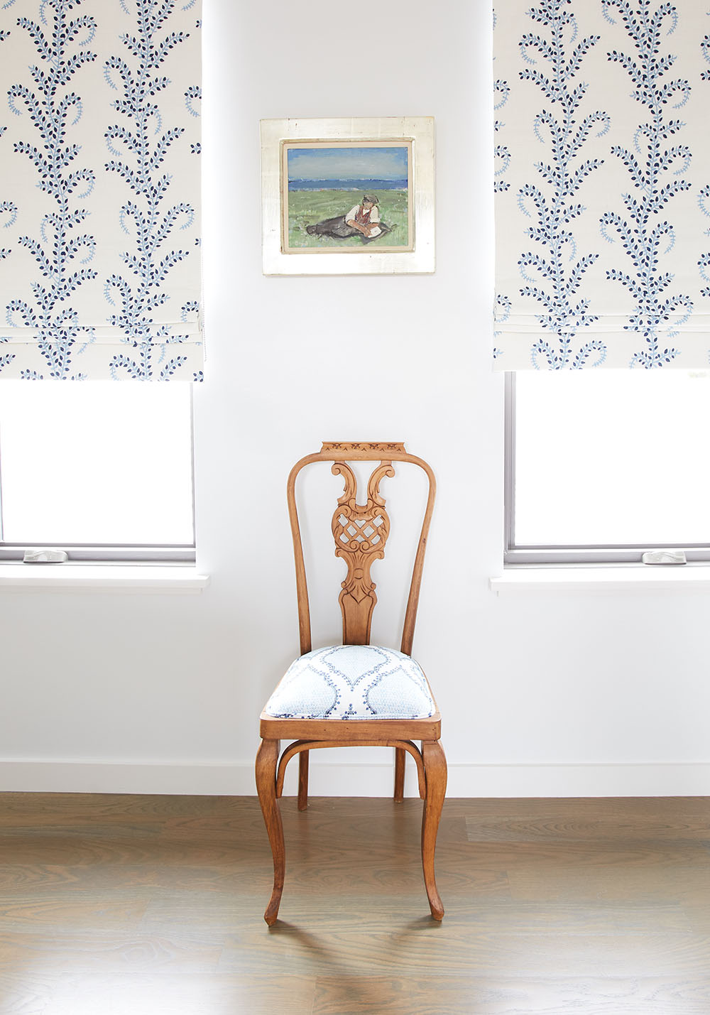
This scene below is the first thing you see when you arrive to the second floor. I can't even tell you how much we love this fabric we chose for the shades by John Robshaw (Azma Blue). The vines are actually embroidered into the fabric (it's not just printed on) so the added texture is phenomenal. The chair is an antique from the colonial period handed down from my parents. I love that it has such a feminine shape.
Below is a shot so you can understand how the walls relate to each other. Remember, the sofa and the rug are old.
If you remember from week 1, the fun chandelier was actually turquoise but when the bookcase was installed it just didn't work. So I painted it a darker blue (Benjamin Moore Downpour Blue) so it would tie in better with the rest of the room. It really made a difference.
Let's please talk about these two beautiful works on paper by Katie Craig hanging on the left (you can read more about her and the works here) which I floated in white frames. They are bright and happy and just look ideal there. I'm so happy we chose yellow lamps to give the room some contrast (we almost went with blue!) and it helps tie in the womb chair as well. I especially love their shape and price (they came in a pair). The desks are old West Elm Parson's desks. We have had these for almost 12 years now. The trash can is an old Ikea basket. Here is a close-up of the left side of the desk. And the fabulous chandelier from Stray Dog Designs as you remember is old but I repainted.
The other side of the desk has the two magnificent works of art that we already owned. The top abstract piece on paper is by GeeGee Collins. I used to have it in my office and did not want to part with, but it looks so good up here that I just had to give it to Miss A. Like my mom reminded me "everything you own will end up being your daughter's anyway, it's ok if you start now". Uhm, yes, so I was happy to give it to her because I know she deeply appreciates and loves this piece. Same goes for my Angela Chrusciaki Blehm mini ribbon, which was originally in our library but also looks exactly right here. The letterboard is from Bandot and the whimsical vase is from Jonathan Adler. The cutest gold pencil holders are from CB2. She got those for Christmas.
Here is another angle so you can get a sense for the room. Oh and the ottomans are upholstered in another equally fabulous John Robshaw fabric called Baris Chambray. BTW, if you are wondering, that small door is the entrance to the attic.
This photo below is a favorite view!! Thank you GeeGee for this beauty you created for us! I can't tell you how much we love it and how happy it makes us.
And here are some detailed shots of the room.
I love how the Jana Bek Jars look against the bright blue bookcase! They are ideal and I found the perfect partner for them with this pretty watercolor by Kerry Steele which we bought some years ago. The red antique encyclopedias used to be mine. My sweet mom kept those for years and have now been officially passed down to Miss A. Although it will be a miracle if she ever opens them seeing as though Google has taken over! They will become collectors' items I hope. The photograph of the three yellow tulips is very old! My mom gave that to me when I moved into my first apartment. I remember she got it at Bergdorf's! It is still so special to me. And the little 'Bijouterie' case was a gift from my dad from his last trip to Paris.
And here is the other side. The blue and white vases are old from Wisteria (they don't have them online anymore).
One of Jana Bek's jars doubling as a fabulous vase. I love their height. They make any type of flowers look regal and magical.
A close-up of the pillows.
A close-up of the acrylic nesting side tables which are old and we won at some school auction. But the highlight in this section is Jeanne McKay Hartmann's watercolor!! Pretty, pretty!!!
And no tween space is complete without a cute letterboard!
There you have it! My daughter's new study/play room! Comfortable and exciting for her but also nice for guests to hang out if they are staying in our upstairs guest bedroom. I wanted Miss A to be in one of the photos but she was in school and time was just too short, but maybe this weekend I can snap one!
I will be reporting back next week or the next with my favorite ORC's of this season for both the featured designers and the guest participants. That will be fun! Thank you all for your encouragement and support throughout the process. It was hard but so fun! I hope some of you are considering doing it next time around, I promise it will motivate you to get that one space finished!
SOURCES
ART
Striped Painting. GeeGee Collins | Two dotted works on paper Katie Craig | Abstract on paper GeeGee Collins | Mini black and white ribbon Angela Chrusciaki Blehm | Watercolor on bookcase Kerry Steele | Watercolor on side table Jeanne McKay Hartmann's watercolor |
FURNITURE AND ACCESSORIES
neon heart | womb chair | cabinet pulls | fabricsAzma Blue and Baris Chambray | ice cream cone vase Jonathan Adler | pink letterboard | Jana Bek Jars | cahdnelier Stray Dog Designs| gold pencil holders | yellow lamps
Did you see the reveal's from yesterday? They are GOOD!!! take a look-
Apartment 34 | Beginning in the Middle | Coco & Jack | The English Room | The Gold Hive
Gray Malin | Jenna Sue Design | Jojotastic | Kelly Rogers Int. | Linda Holt | Marcus Design
Michelle Gage | Natasha Habermann | The Painted House | Rambling Renovators
Sacramento Street | Shannon Claire | Sketch 42 | Stephanie Kraus | Bisou Style
Media Partner House Beautiful | TM by ORC


