Marvelous apartment in Madrid
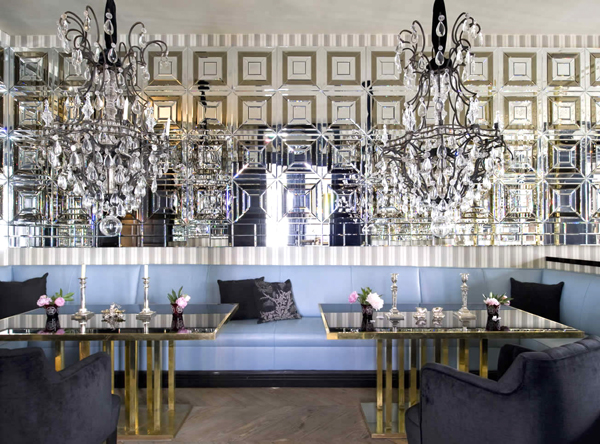
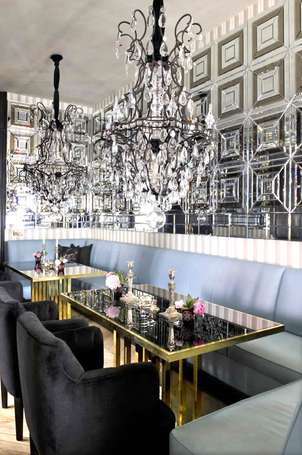
This beautiful apartment in Madrid designed by Lorenzo Castillo is a jewel. This dining room set-up stole my heart. I have always been a big fan of dinner parties. I love giving them and going to them. Nothing beats an evening with friends over delicious food, good wine and even better conversation. I also love when people with large spaces opt for having two dining tables- it just breaks up the room so nicely. Add to this shiny chandeliers, beautiful mirrored walls, brass tables, and a banquette and you have yourself a glamorous space that is probably the envy of many.
I was curious about the rest of this home and was equally amazed. Beautiful, beautiful. I also gathered some points to take away and things we can apply in our own homes from Lorenzo's design here. Let's take a tour:
1 || Perfection is overrated. There is so much symmetry and balance here, but the little brass lamp breaks it up and adds character.
2 || Levels. There is something at every level. The decor keeps your eyes moving and exploring- you start off with the rug, then to the small coffee tables, then to the chairs, then to the lamps, artwork a bit higher up, then the mantel with those amazing , and then more art hung near the ceiling. A feast for the eyes indeed. Having things at different heights creates richness and warmth. This great but.....
3 || Your eye needs a resting place. Key the white upholstered furniture. This is a busy room but it is balanced out by the white-upholstered sofas and arm chair. Everything is deliberate and has a reason for being.
Again Lorenzo plays with creating an imperfect space with the chaise and accent chair positioned at an angle. And again he adds richness by having many levels for the eye to explore and again hanging art on top of art.
4 || Every library needs sconces. I strongly believe in this. (Remember this post?) And these in particular are to die for. I wish I could get a better view of them.
5|| Coziness is key. Space is limited here. There is not much space between the chairs and coffee tables, or between the books and chairs- giving the library a cozy feel that nurtures conversation and socialization. Also, the dark and moody bookcases help the cause.
6 || Horns can be glam too. Wao, love the horns against a mirrored wall decorating what seems to be a bar at the end of the dining room.
When can I move in? Which was your favorite shot?


