One Room Challenge Reveal || Walk-in Closet
The One Room Challenge reveal is today! I can't believe six weeks went by this fast. It was a very exciting makeover for me and I'm so pleased with the end result. I hope you all like it too. If you are new and don't know what the One Room Challenge is it was started by Linda from Calling it Home some years ago. In this challenge she lines up twenty talented interior designers and professional bloggers to redo a room in their home in just six weeks- we update you once a week on Wednesdays. And today it is not only Wednesday but also it's the big reveal of the project. If you are checking in for the first time you are in luck, because the reveals are always the most exciting part. (In case you missed them here are this round's previous posts- one, two, three, four, five). Before you go on, I think you should re-visit the before photos of the closet here so you can really appreciate the difference.
I worked on my walk-in closet for this challenge. I was on a budget, so I thought that by doing my closet, which is a small space, I could get more bang for my buck. It turned out exactly as I dreamed it would- beautiful and serene. It has become my special retreat to get away from the daily hustle and bustle. I feel very pampered in here for sure.
Without further ado here is my closet-
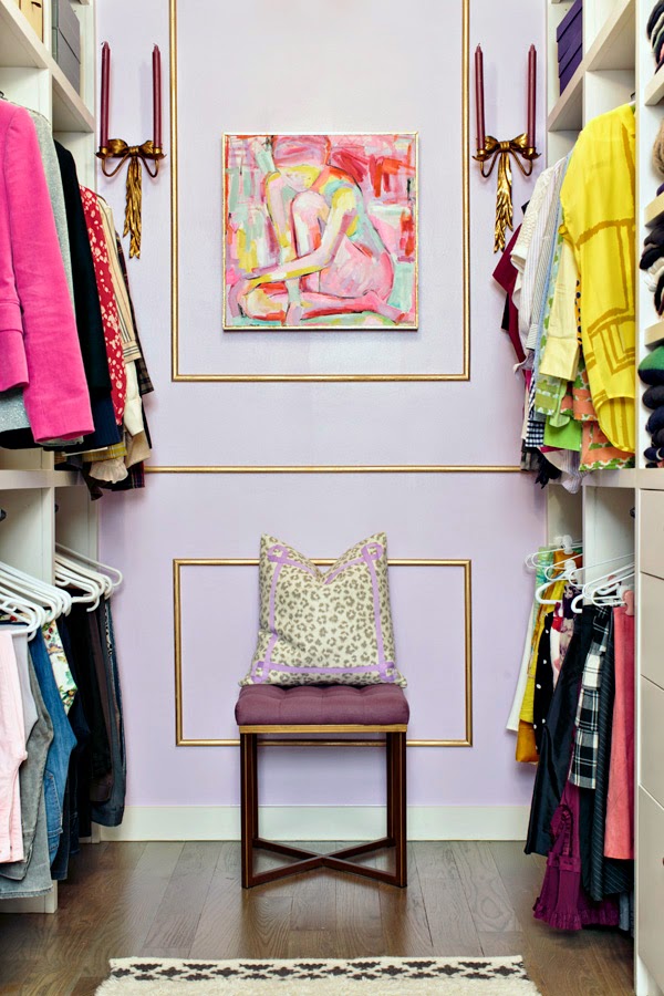
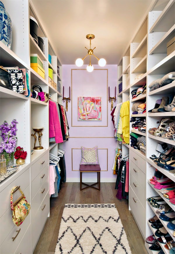
This is what you see upon entering my closet. The lilac color with the gold trim really makes the space special and original. And here was where I controlled my costs. It would have been ideal to use wallpaper in this closet but wallpaper is so expensive, especially the pretty designs I love. I had to find another way to make a statement and lilac paint with some delicate gold trim was my solution. I painted the room and the trim myself, but did hire acarpenter to measure, cut and apply the trim to the wall. He charged under $200, which I thought was money well spent.
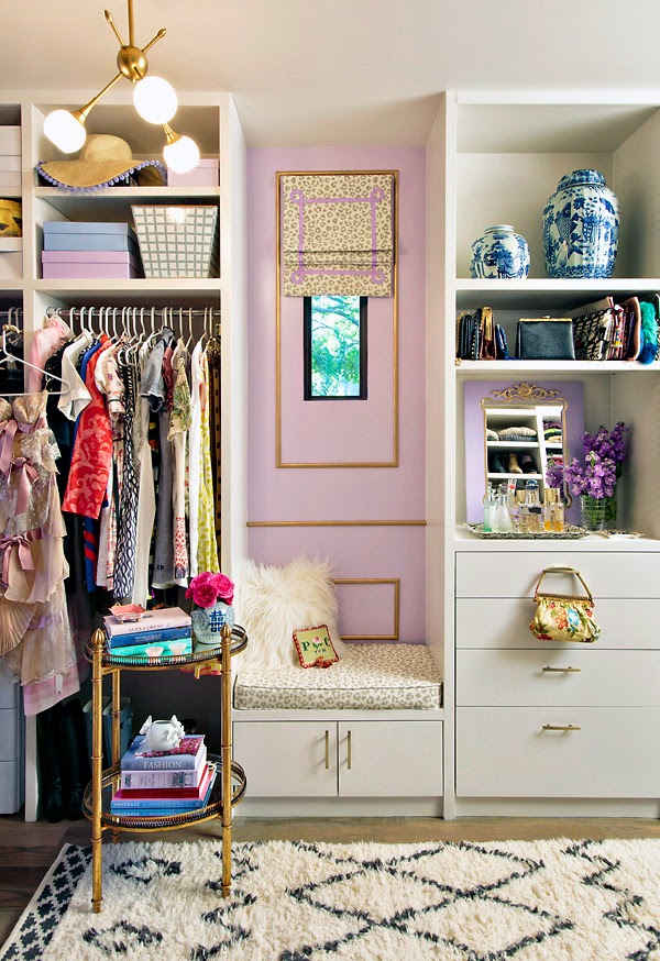
The pretty pendants are by George Kovacs. They are quite the upgrade from the generic flush mounts that were in here originally. I am so pleased with their simple and modern aesthetic, as well as their price.
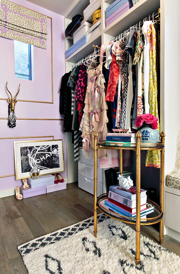
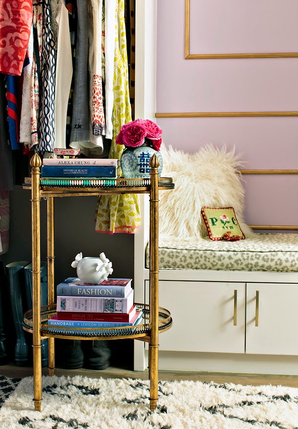
The two-tiered gold and mirror table is from LampsPlus (c/o) and I have to say I love the look of having a free standing table here to hold my pretty books and flowers. It also adds warmth and makes the space feel less like a closet. The extra storage is very appreciated. The leopard fabric is from Calico which I embellished with some lilac grosgrain ribbon. The beautiful blue and white jars are from The Pink Pagoda and the cute storage bin with the basket weave design is from Jaye's studio (c/o). I would love to have a few more of these because they are so practical and look so good up in my shelves. They really dress up the space. If you follow me on Instagram you know how much I love this West Elm rug. I hesitated getting it because every blogger has it. But I now know why they all have it...because it is fabulous!
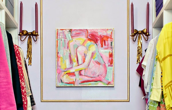
This inspired nude by Reagan Geschardt, which I commissioned through The Pink Pagoda, is, in my opinion, the highlight of the closet. A nude in a closet is just genius of course it had to be Jennifer's idea. I am in love with the colors against the lilac walls and the energetic brushstrokes. The unexpected colors like the yellow and mint really pack a punchand the 20x20 size is also ideal. I love art and am so happy to be able to enjoy it in my closet. I have always thought that every one should own a nude and so this is my first one, which is kind of exciting. Do you own a nude? If you are as #obsessed with this one, as I am, and decide you need one in your life STAT The Pink Pagoda has a few nudes still for sale here. Or you can commission your own to match your style as I did. I can't recommend working with Jennifer enough. Let's be art nude twinsies!!
Also, I'm sure you recognize the bench beneath the painting because its from Target (similar). I can't believe the color went so perfectly with my closet and really it was jsut a coincidence. Also, you may remember that Elizabeth from The Little Black Door helped me find these divine candle sconces. They are so Parisian no? And they flank the painting beautifully.
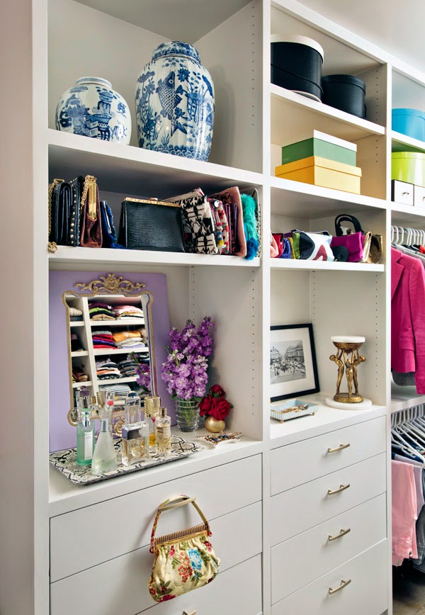
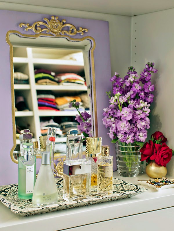
I loved how my painted HomeGoods mirror came out in lilac and gold. I painted it a darker shade than the walls from one of the wall samples I had leftover. Nothing goes to waste around here.
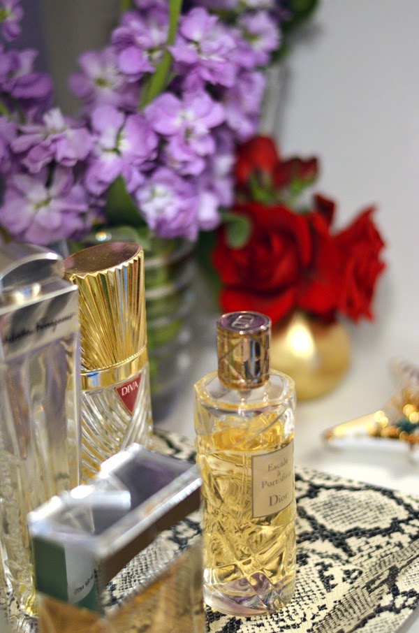
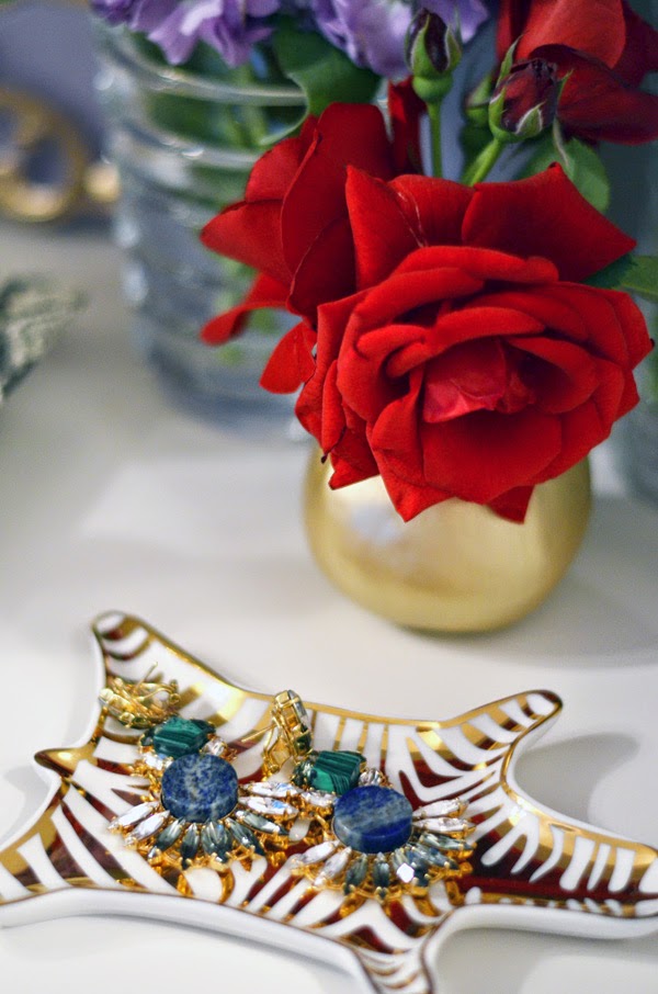
The famous or infamous Jonathan Adler gold zebra tray. My sweet friend gave me this as a present and I love it. I know it's a blogger cliche but I admit I had been coveting it for a while and am so excited to finally have one of my own. The python tray with the perfumes is from Furbish. I can't tell you enough how much I adore that tray. You all need it, I promise.
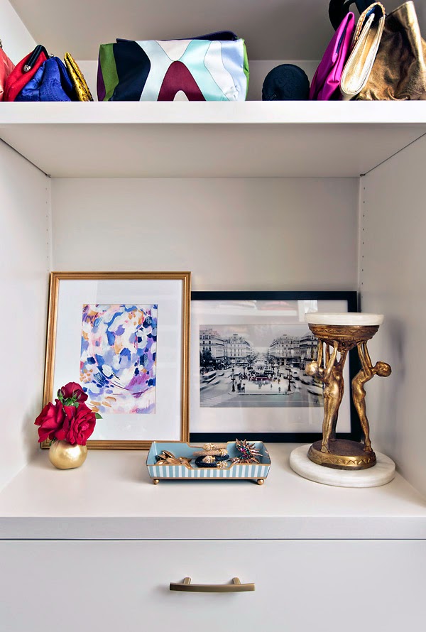
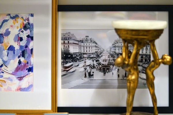
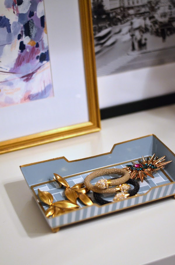
I love the look of leaned art on my shelves because it gives off a relaxed vibe. The abstract piece is by Katie Craig and the photograph is by Molly from Dreams in HD. I love how Katie's piece brings in the lilacs, purples and gold and Molly's photograph adds that black and white contrast giving the corner a more modern feel. I really admire both these artists and think their work is beautiful. I had them framed locally. If you are from Dallas you need to know about Jon, the owner of Decor Art and Frame. He is on Greenville, just north of Lover's Lane across from Michael's. He is so nice to work, does beautiful work at very fair prices. The bronze statue is a Mexican flea market find. And the trinket tray is from Jayes Studio (c/o)
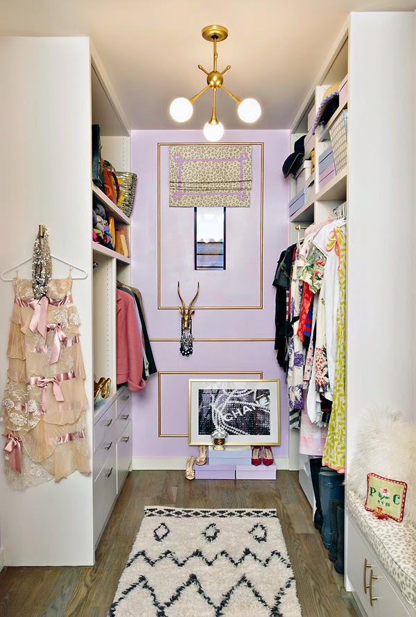
And here is the other end of the closet. BTW that pretty pink and lace dress is what I wore to our rehearsal dinner some years ago! It is one of the prettiest dresses I own.
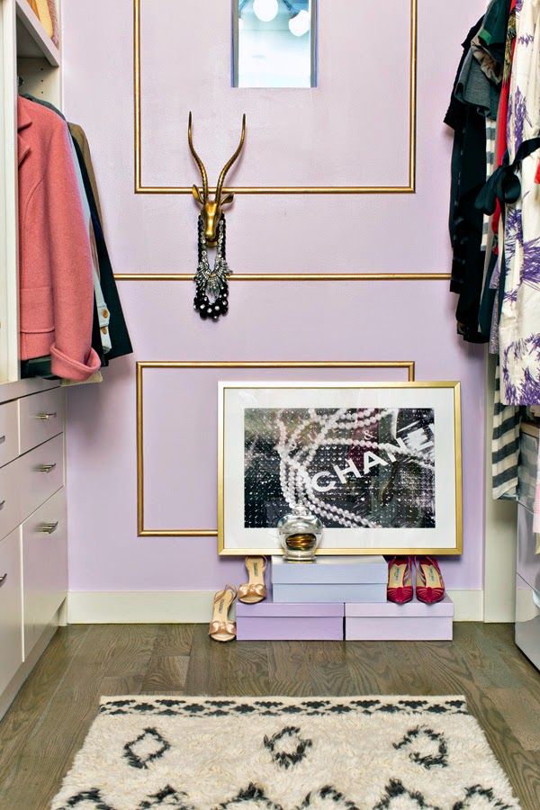
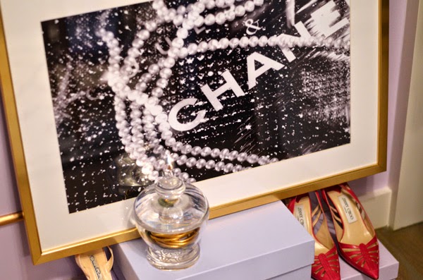
In my week 4 post I talked about my art selections and how Christine from Bijou and Boheme, had recently launched her art concierge services to help people find that special work of art. I was her first client! I wanted a large format photograph that would add a bit of cool and edge to my otherwise super girly closet. I knew of several photography sources but could not find the kind of work I had in mind. Christine, who has such fab taste and always sources the coolest things sent me a few options over after I gave her an idea of my design plan and feel for what I was looking for. I fell in love with this perfect photograph titled Chanel Pearls from These Fine Walls. I am so pleased with the selection. I feel like the black and white adds some contrast and keeps the room from being too sweet.
I had a hard time deciding whether to frame it in white or gold. The safe bet would have been framing it in white but I took a risk and framed it in gold. I think it turned out kind of cool and I actually really love the edgier look and think it pairs perfectly with my vintage gazelle head from High Street Market. They always have a great selection of vintage pieces and is the home of one of my favorite trays. The gazelle is perfect to display my go-to necklaces. Little Miss A. has so much fun switching them around and telling me which one I should wear. She thinks she is my stylist!
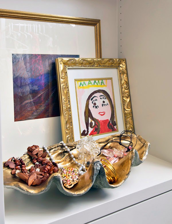
This gold faux shell from Adriana Hoyos (c/o) is such a beauty and is perfect for displaying all my pretty jewelry. I love the shape and glam factor it gives. It plays beautifully with the portrait my daughter did of me ( I wish I had eye lashes like that). I may have made my closet too pretty and comfortable because now my daughter is hanging out a lot more in it. She always leaves her shoes behind.
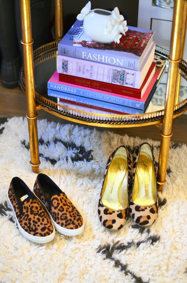
And I need to tell you about the rug pad (c/o) beneath my now favorite West Elm Moroccan rug....It is from Rugpad USA. I blogged about their amazing quality rug pads before here. it is silly that I would get so excited about a rug pad. But the quality is really good and now it kind of feels like I'm walking on a cloud when I step on this rug.
Thank you all for following along my little design adventure and for all your support. A huge thank you to Linda for organizing and coordinating this amazing challenge and for being everyone's best cheerleader. I'm honored to have been a part of this wonderful experience. It forced me to attack this project head-on, while at the same time, connecting me to such a supportive and unbelievably talented group of designers/bloggers from all around the world. Thanks Linda for including me in this talented group.
Also, thank you to the sponsors- Jayes Studio, Lamps Plus, Adriana Hoyos , and Rugpad USA for your great products that I genuinely love and am proud to have in my home.
And now let's check out the other fabulous reveals. This will be so good!!
