One Room Challenge || Week One - Friend's Playroom
The One Room Challenge starts today!! And I’m so lucky and honored to be one of the featured designers this time around, which is amazing!! The other 19 designers who are part of this challenge are really fabulous and am just so excited to be within this special group of talented designers. If you follow me, you know I love this challenge and have been a part of it a few times already as both a ‘featured designer’ (way back in the day!) and as a ‘guest participant’ most recently (you can see my past room transformations here). Yes, I’m such a fan that I have a special section dedicated solely to the One Room Challenge on my blog.
For those of you who don’t know about the One Room Challenge it is a really fun event where 20 designers choose a space to transform in just 6 weeks and document all the progress weekly in their blogs every Wednesday. It all ends on November 7th where we all reveal our finished spaces. This challenge was founded and created by Linda from Calling it Home and she has grown it tremesndously ( it is now on it’s 14th season!) and created a real cult following for it, which just makes this event so fun, supportive and collaborative. It is like a feast of creativity and inspiration in my opinion. If you enjoy interior design you will love following along. We also have very generous sponsors that really help us finish our spaces and Better Homes and Gardens is our media sponsor.
First, let me tell you about the space. I will be re-designing my friend’s 10-year-old daughter’s playroom. This friend of mine, let’s call her Mrs. C, is the sweetest and the bravest friend for letting me attempt this challenge in her space. I made sure she understood our need to make quick decisions and to be flexible. Now, this will be a test of our friendship! She was onboard from the first moment and is a dream client. I love how we can stress over everything together.
This playroom should be sophisticated enough to last through high-school graduation and beyond if they decide to stay in this same home. The space needs to be young, chic, practical and fresh. It needs to include a good workspace for homework and for group projects, a space for lounging and watching movies, it has to have good storage and the bar/kitchen area needs some tlc.
The color palette we have chosen is blue and white. Blue and white really is such a fabulous combination. We would love to do some sort of accent wall with fun wallpaper. Here are some inspiration photos-
I just love this image from the Bar Palladio in Jaipur (Another of the many reasons I want to go to India!).
I especially love this adult version of a playroom- the Game Room (image via the buzz).
I love some bright pink against the dramatic blue and white like this from a Harbor Island retreat. (image via Danielle Rollins)
I love the freshness of this image photographed by the super talented Alyssa Rosenheck (image via )
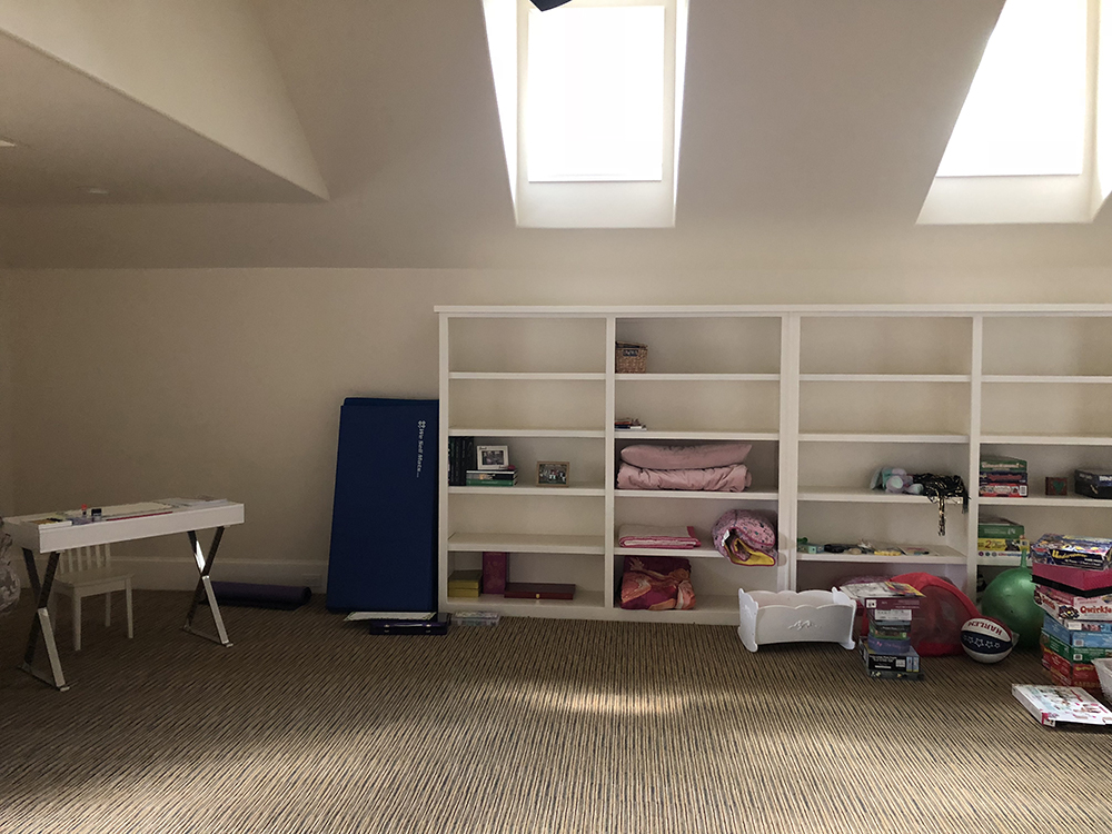
And now here is the actual space currently-
This is the wall you have in front when you enter the room. Notice the beige walls, the not very attractive fans….It’s a big space and there aren’t that many windows. We need to really lighten it up.
I envision this window nook to be the perfect area for a desk. Nothing like working with natural light and a pretty view.
And this area could be perfect for a work table where collaborations and group projects can take place.
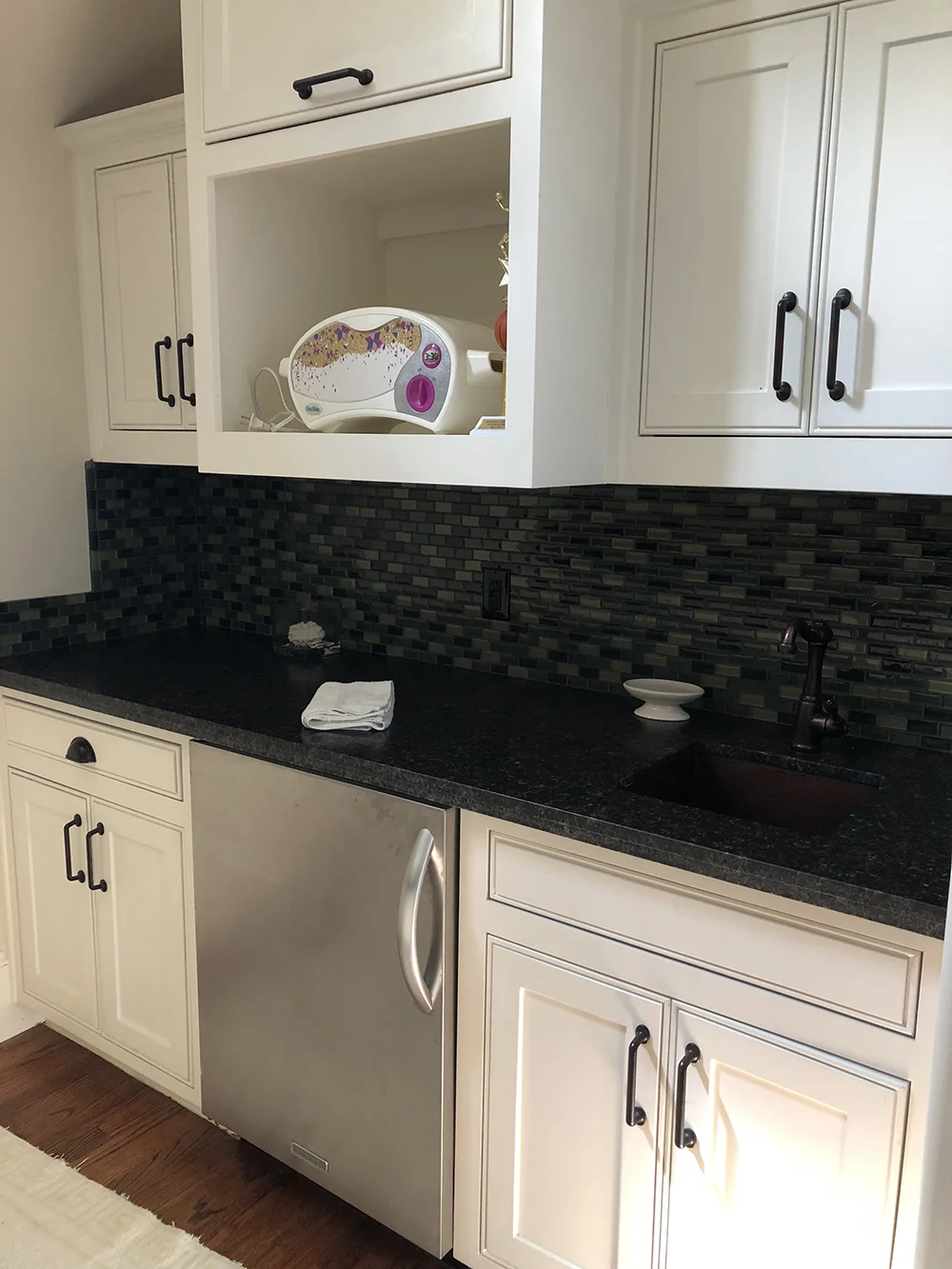
They need to have space for storage to hide things. With kids, you have board games, toys and a plethora of other items that no matter how talented you are you can’t really style. So we need space to put things away. Uhm, please notice the bar lights in the kitchen area and the second fan. Nope.
The combination of this super dark countertop, green backsplash and beige cabinets was not working for us. AT ALL!
Also, this rug. It darkens the space and the colors are not to our liking. Green and beige? Yikes!
As you can see there is plenty to do! Here is the checklist I have so far:
Paint walls and ceiling in a light brighter color
Change rug
Refresh kitchen/bar area
Take out fans and replace with pendants
Replace bar lights
Find appropriate desk and work table with chairs
Find appropriate sofa
Art
Bookcase
Wallpaper Accent Wall
Come up with color scheme and find fabrics that coordinate with accent wall for accessories.
And I only have six weeks! They don’t call this a challenge for nothing! Our sleeves are rolled up!! Follow along with me for the next 5 Wednesdays to see the room’s progress toward a (hopefully) fabulous transformation. In the meantime, please visit the other featured designers to see what their projects are all about. What a fantastic group!
At Home with Ashley | Bre Purposed | Dabito | The English Room | Erin Kestenbaum
Harlow & Thistle | House of Brinson | J & J Design | Kelly Golightly | Linda Holt
Megan Bachmann | Michelle Gage | Mimosa Lane | Murphy Deesign | Vestige Home
Old Home Love | SG Style | Shay Geyer | Sita Montgomery | SMP Living
Media Partner Better Homes & Gardens | TM by ORC


